Supporting accessibility in iOS applications

iOS Developer at Hepsiburada
To develop the best product, we should be making a good user experience for everyone. People with disabilities should be considered in everything.
When it comes to software products, they need to be accessible. Disabilities should not be a barrier to their usage. Products should be usable for everyone. By making your app more accessible, you can reach a larger audience and make it easier to use.
Operating systems do have accessibility features for their users, and mobile developers for iOS devices should consider getting benefits from these accessibility features. Today, I will be focusing on iOS app development for supporting accessibility.

Photo by Ben Kolde on Unsplash
In iOS devices, when you open Settings, you will see a title called Accessibility. As I mentioned before, accessibility is a general concept, so there are many options to help people use the applications in their best use case.
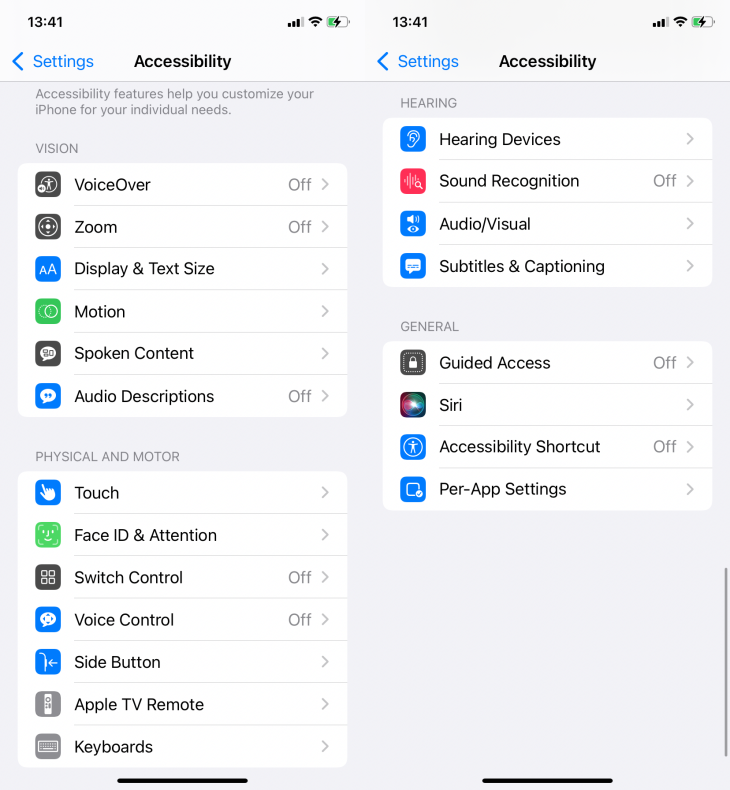
What we can do to support accessibility in an iOS application are research the iOS capabilities and features, and how we can use these features in our apps. Today I will provide a few common examples to give you an idea.
An accessibility example: Contrast
As I mentioned previously, there are some responsibilities for designers. Before we start the technical stuff, I would like to give a basic tip for supporting accessibility.
If you are developing an app on your own, focus on color contrast. To make your app easy to read and see, the background and the text colors should contrast each other. It is beneficial for everyone but especially for people with low vision and reading disorders.
Let’s see the example below. The left one has more contrast than the right one. The label and the button text are more readable, right?
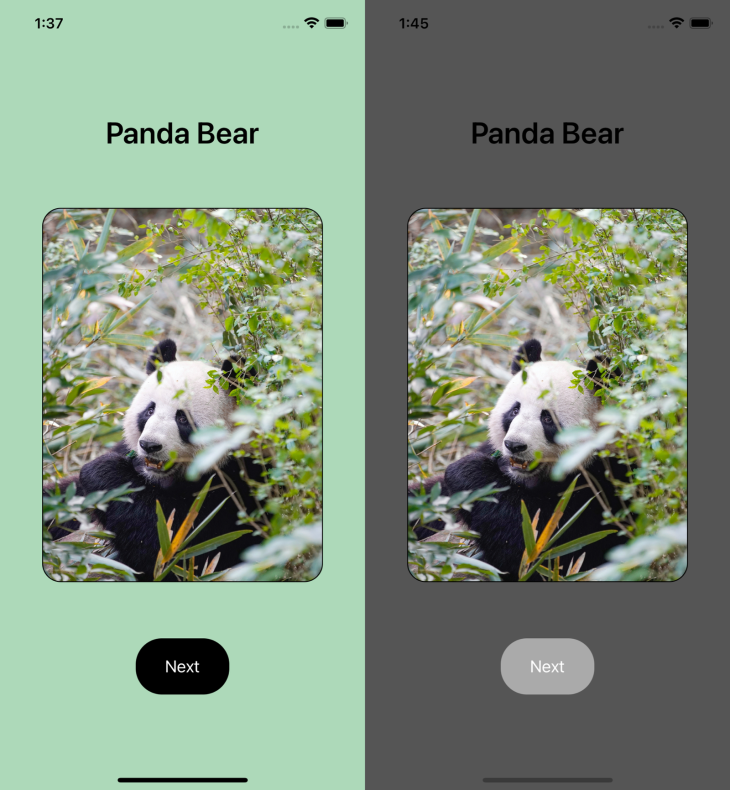
This is an example of accessibility to bear in mind when creating your app, related to visual design.
Accessibility features on iOS
Now, we can go over accessibility features for iOS. I created an example iOS application and we will walk through it in each step.
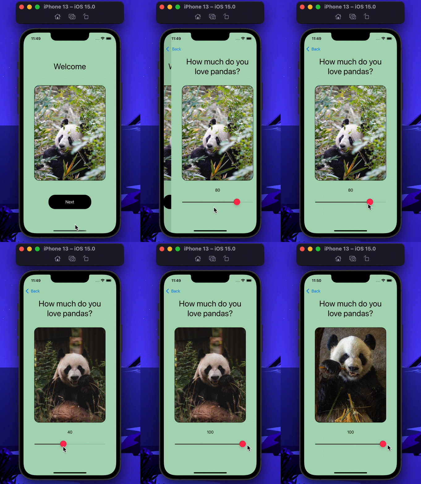
This app consists of two screens. The first screen has a label, image, and a button to navigate the second screen. The second one includes labels, an animation consisting of four images in a loop, and a slider. Let’s cover this app’s accessibility features.
VoiceOver
I will mention VoiceOver a lot, so I need to talk about what it is first. VoiceOver is a screen reader on iOS and iPadOS devices. It reads the user interface of the device to help people with visual impairments, and it is also used by people who have motion sickness and when they are in a moving vehicle.
VoiceOver reads the screen as much as possible, but developers should also be sure it reads coherently. For instance, we have text on the screen and a star icon button to add the text to favorites. Probably, it will read the button as “star, button,” and developers can change the way it reads and give a label like “add to favorites, button.” It is better to check and give some attributes for VoiceOver by code to be more informative to users.
By coding with VoiceOver in mind, you can decide:
- which UI element is or is not to be read by VoiceOver
- what the text will be when it is reading that element
- what the value will be when it is reading that element (e.g., if the button is selected or not)
- what can be a hint for that element to inform the user moreisAccessibilityElement: Bool
This shows the value of whether the UI element is accessible or not. If you use a UIKit element, the value is true by default. If you create a custom UI element, you need to set this attribute to true.
accessibilityLabel: String?
This is a string that an assistive app — VoiceOver, in this case — reads for that UI element. VoiceOver reads the text of the UILabel or UIButton by default. However, you can still give the accessibilityLabel to be informative.
accessibilityValue: String?
The current value of the accessibility element is represented by a string. For instance, it can be a text value from a UILabel, a percentage from a UISlider, etc.
accessibilityHint: String?
You probably need to use this in some cases but not always. If you would like to give too much text to read in the accessibilityLabel, you may move some of them to the accessibilityHint. accessibilityHint gives the clue of what’s going to happen if they press that button or use some UI element.
Bear in mind that, generally, UIKit elements have default values to support accessibility. However, if you create a custom UIView subclass, you need to create an instance of UIAccessibilityElement. In this way, you will be able to use UIAccessibility properties.
To start my example, I didn’t need to code anything related to VoiceOver and ran my project with VoiceOver. Here is the demo:
I found out that it doesn’t see the image as an element and doesn’t read anything related to them. In addition to that, I also wanted to customize some values because VoiceOver was reading the default texts of the UILabels.
⁕ I added an accessibility label to my UILabel and it shows the text as Welcome. However, VoiceOver reads it as “Example Accessibility Label” because I customized it.
let pandaLabel = UILabel()
pandaLabel.text = "Welcome"
pandaLabel.accessibilityLabel = "Example Accessibility Label"
⁕ pandaImageView is what I called my image view, and I added pandaImageView.isAccessibilityElement = true to inform VoiceOver that it is accessible.
⁕ I added an accessibilityLabel to my image view and gave pandaImageView.accessibilityLabel = "Panda"
⁕ I also added accessibilityHint to the next button at the bottom, to inform the user what that button performs when it is pressed.
let nextButton = UIButton()
nextButton.setTitle("Next", for: .normal)
nextButton.accessibilityHint = "Navigates to the next screen"
So, let’s see how it is changed:
Text size
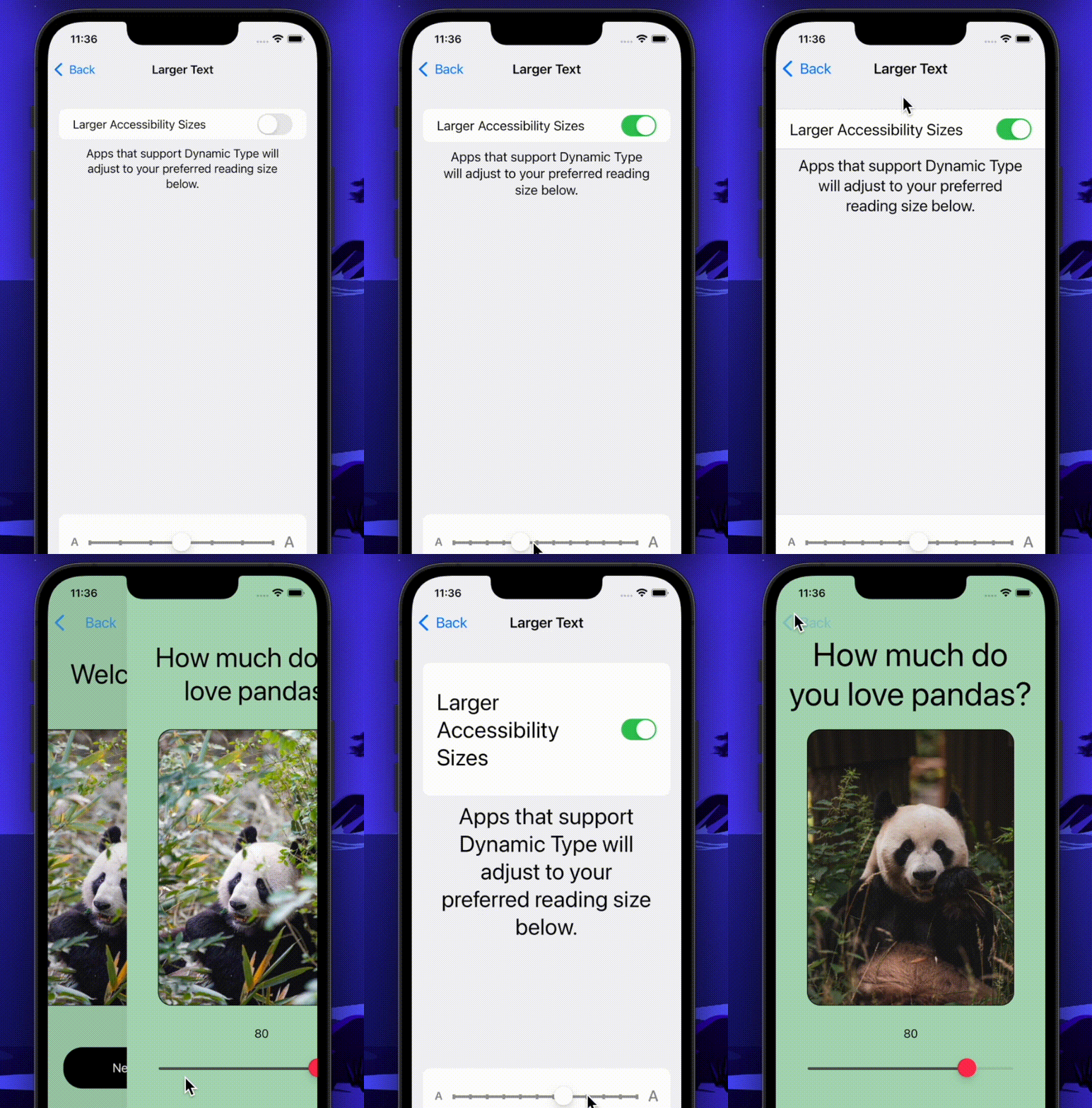
While developing, we generally give the font-size value to meet with the design. However, it doesn’t let users change the font size according to their visual capabilities and preferences.
For this example, I first created a screen, including hardcoded font size.
let pandaLabel = UILabel()
pandaLabel.font = .boldSystemFont(ofSize: 24)
As I mentioned before, in this case, font-size does not change according to accessibility settings.
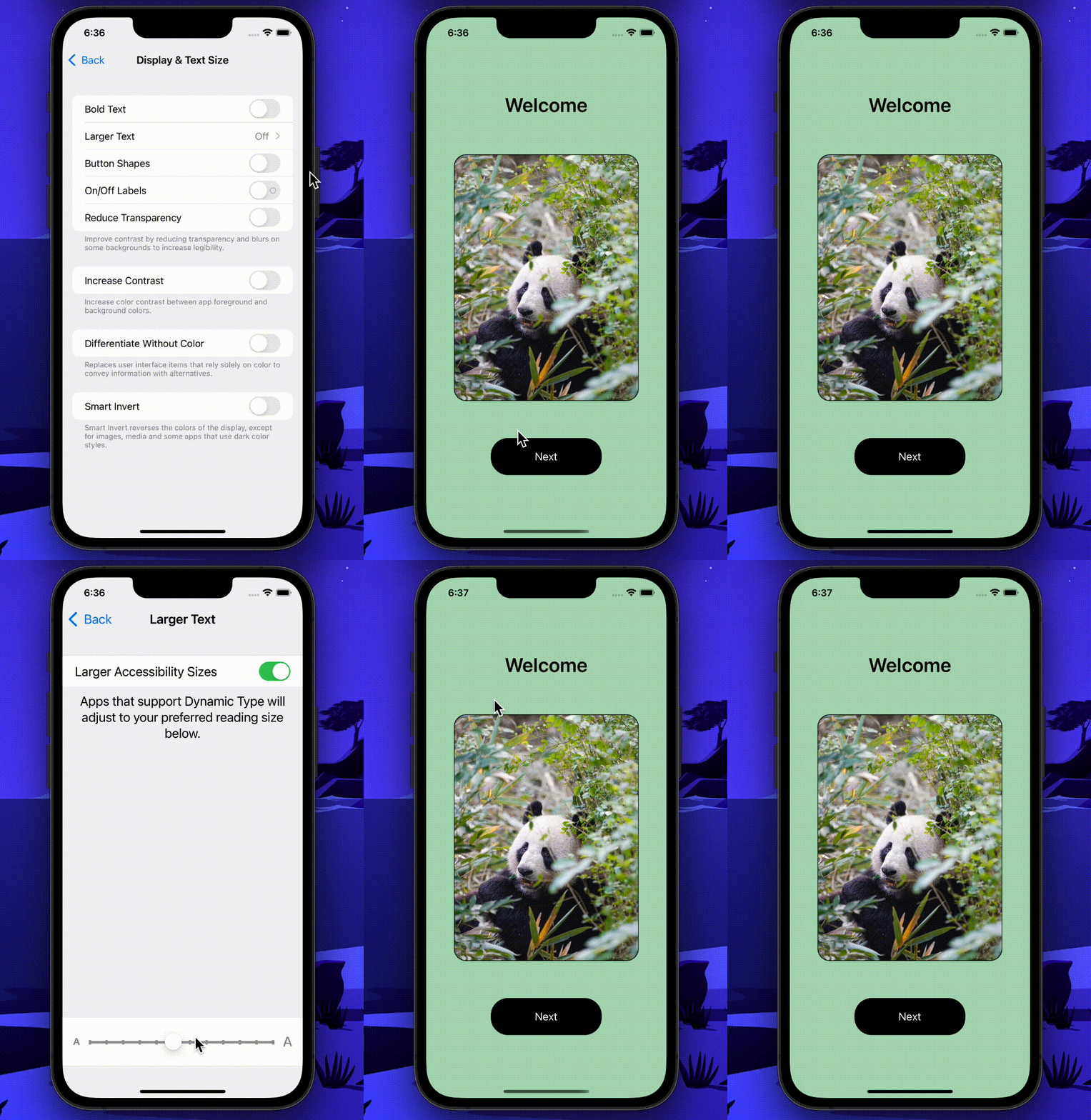
What we can do here is give a dynamic text size to the label to meet the user’s intentions.
N.B., sometimes a user’s choice can lead to inaccessible app UI. For instance, much bigger text sizes can cover the whole screen and displace a button.
Let’s see how we can give a dynamic text size to the label.
let pandaLabel = UILabel()
pandaLabel.font = UIFont.preferredFont(forTextStyle: .body)
pandaLabel.adjustsFontForContentSizeCategory = true
pandaLabel.numberOfLines = 3
Reduce motion
Reduced motion is used for people who are sensitive to motion effects and screen movements. Reduced motion disables the animations in certain applications.
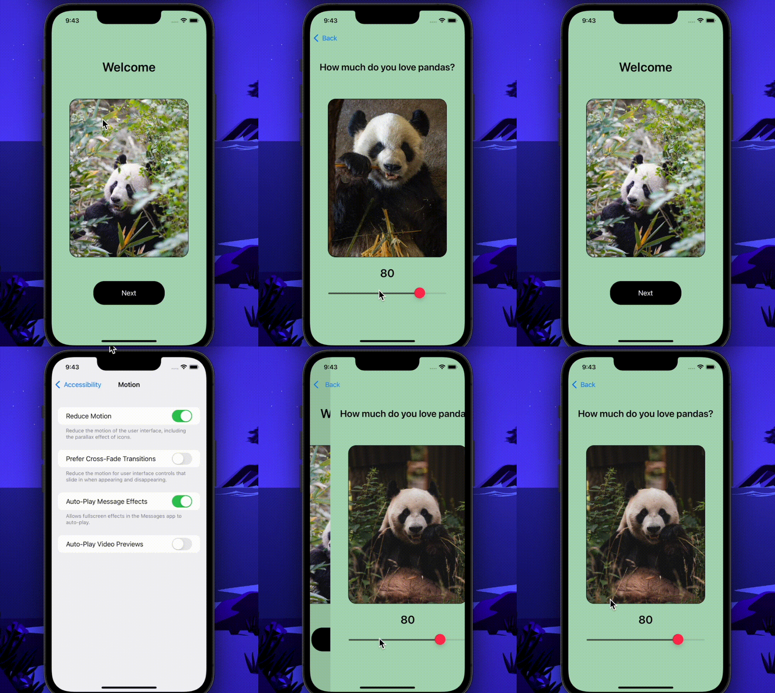
If we have any animation, switching on the Reduce motion feature probably won’t disable the animation in our app. What we can do here is remove the animation if the Reduce motion feature is enabled by using isReduceMotionEnabled property.
We can benefit from this feature using this code snippet.
if (UIAccessibility.isReduceMotionEnabled) {
// add what your app should do with reduced motion version

} else {
// add what your app should do with motions are allowed

}
In my example project, I created a UIImageView, an array including four images, and made a loop to show these images in that image view. In the beginning, when I enabled the ReduceMotion switch, it didn’t affect my application. So, I decided to show one image when it’s enabled like in the following.
if (UIAccessibility.isReduceMotionEnabled) {
// Settings > Accessibility > Motion > Reduce Motion switch is turned on
    pandaImageView.image = UIImage(named: "panda2")
} else {
// Settings > Accessibility > Motion > Reduce Motion switch is turned off
    let animationImages = \[UIImage(named: "panda.png")!, UIImage(named: "panda2.png")!, UIImage(named: "panda3.png")!, UIImage(named: "panda4.png")!\]
    pandaImageView.animationImages = animationImages
    pandaImageView.animationDuration = 1.5
    pandaImageView.startAnimating()
}
In the end, it turned into this:
Conclusion
We are living in a digital era, so why don’t we make it accessible for everyone? If we want to create a better world for humans, we can start here.
Each major iOS version update brings new accessibility features. We can start by staying up to date on the capabilities of these features and how we can support them in our applications.
Today, I covered some tips on supporting accessibility in iOS applications. It is a broad concept, so I mentioned as many as possible. You can reach my demo app here.
If you would like to give any feedback, ask questions, or share something, feel free to reach out to me via hi@iremkaraoglu.com. For further information, I recommend you to check out the resources in the references section.
See you in the next article!
References
- https://developer.apple.com/accessibility/ios
- https://developer.apple.com/documentation/uikit/accessibility_for_uikit
- https://developer.apple.com/documentation/objectivec/nsobject/uiaccessibility
- https://developer.apple.com/documentation/accessibility/supporting_voiceover_in_your_app
- https://developer.apple.com/design/human-interface-guidelines/accessibility/overview/text-size-and-weight/
- https://developer.apple.com/documentation/uikit/uiaccessibility/1615133-isreducemotionenabled
- https://developer.apple.com/documentation/uikit/uifont/scaling_fonts_automatically
The post Supporting accessibility in iOS applications appeared first on LogRocket Blog.


