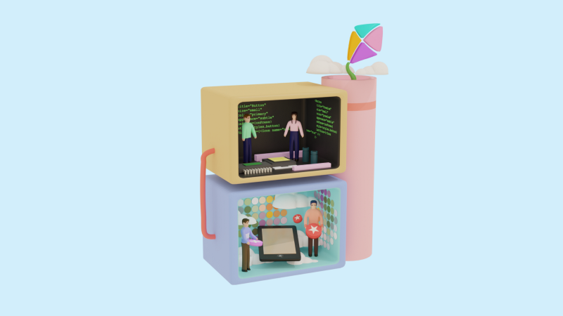
Building Design System in React Native 🎨

iOS Developer at Hepsiburada
If you are running a company a Design System will probably let you create screens quickly and as intended! But..what is a Design System?
A design system is a system that all your components are already planned to use in the screens to be compatible. So the designers decide on what kind of buttons there will be in the application, which colors will be used, and so on. So, when a screen is updated or a new screen is coming up, designers focus on making it compatible and use the same kind of components or improve them without changing them much. After all, the design process becomes faster than before and the development as well. 🏃♀
Building a design system requires teamwork. Now, I’m going to mention what we have done in Otsimo as the development team and how we cooperate with the design team.
The design team discussed what kind of buttons will we have, which size, font, colors, and so on. After all, we started to build the components and also made a specific React Native application to see what the design components are. It gives us the benefit of seeing how an upcoming component is compatible with our system, how do they look, and inform us about the design system components. Nowadays, we are updating our products with the new design of the screens using design system components! 🧙🏻♀️ If all of these sound complicated, don’t worry it will be clear. Let’s start!
Typography
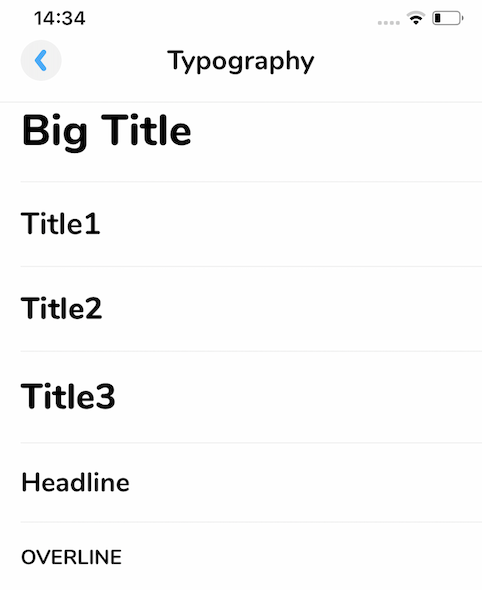
Text variants were decided and as developers, we created our Text component which takes the variant as a prop and we only use these variants to maintain our design system.
The code snippet shows how we would style a text in a way that probably most of you all know. What we have done is, having stylings and just giving the styling name as a props, and voila! Let’s see how it works.
We called our text component as OtsimoText. It works similarly with the Text component, the only difference is it has the variant props.
Two of the variants are listed below. So, the styling changes according to that variant and it makes our job easier.
Colors
Designers set the color palette that our application will have and as the development team, we created a file to add these colors as constants and named them. We don’t use any other HEX or RGB code, we stay in that color palette.
Some colors are listed below.
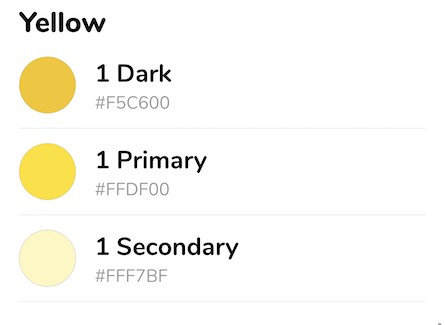
Writing style={{ color: colors.yellow.dark1 }} instead of style={{ color: “rgb(245,198, 0, 1.0)” }} is more practical and also prevents typos.
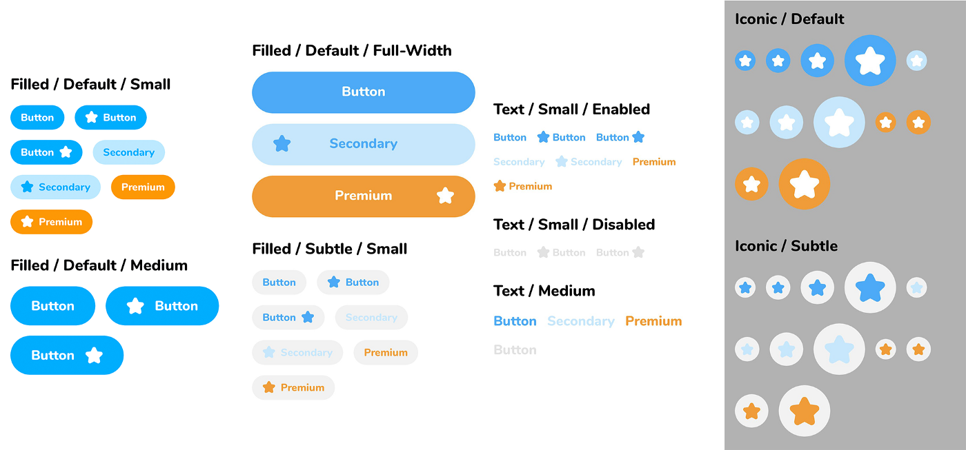
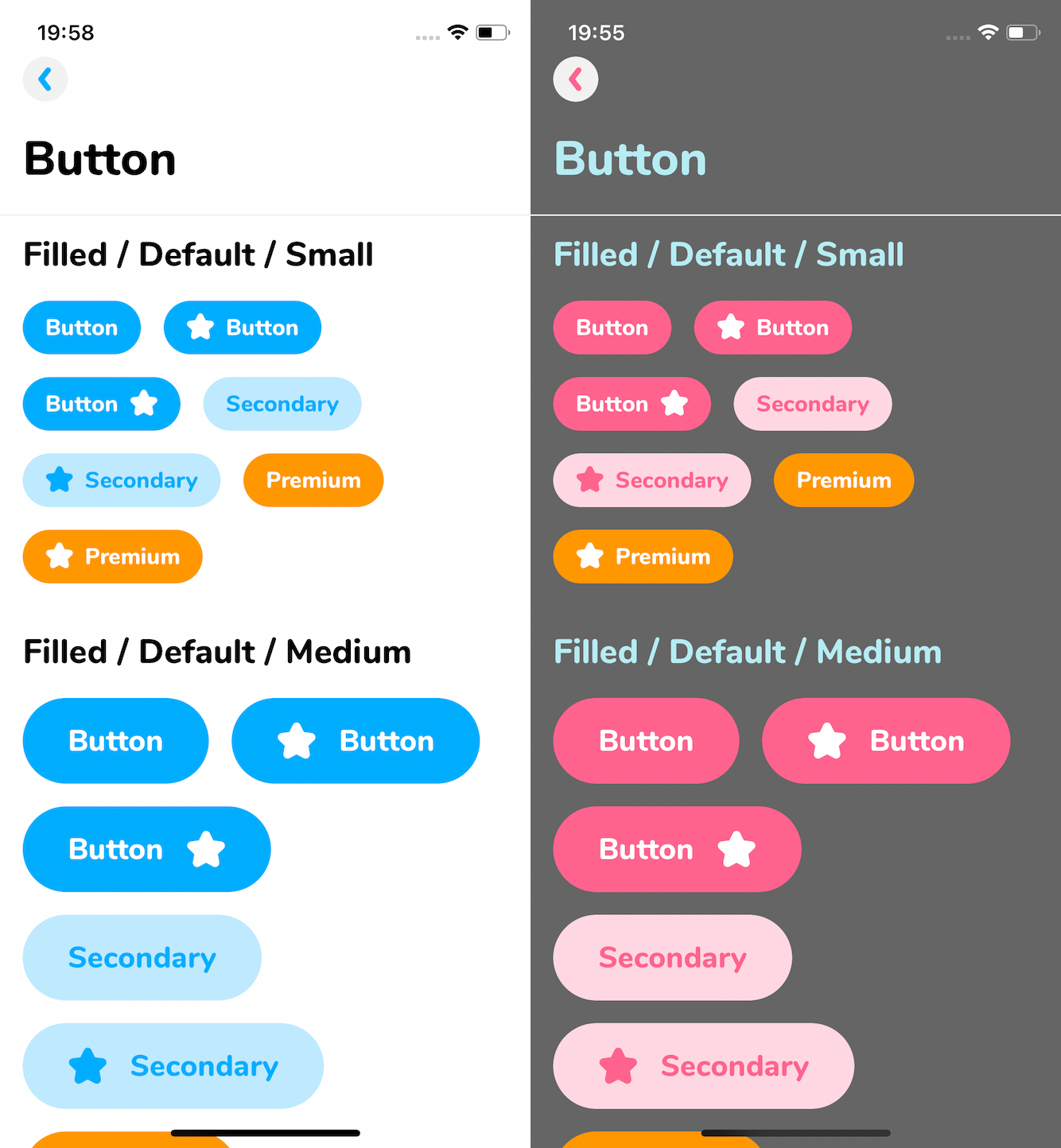
Buttons
Designers designed what kind of buttons we will have and they divided these into three.
- Filled Button
- Text Button
- Iconic Button So, we created separate components for each of them. They have the Pressable component inside.
Example of our button variants:
👩🏻🎨 Theme Support
Until here, all were somehow easy if you are already a React Native Developer. Let’s dive into deep and build a theme! But why do we need that? We have several mobile applications and each one has different color palettes. We care about reusing the components and we don’t want to give hardcoded color values, therefore, we build theme support and each application gets the color from its theme. For example, one application may have a dark background, one may have light and we get the color value from its theme according to which application is it. After we built this, it became essential for us. Let’s see how it works in detail.
If you have a theme with background, primary, and secondary colors and you change one of the colors in your theme, the change will apply to every place where the color is used in the application.
Assume that your primary color in your application is dark blue. You use this dark blue all of your buttons in your project. You access this color not by this dark blue’s hex or RGB numbers, you access it by your theme like color:theme.primary.
When you change your opinion about this primary color and you decide to make it dark green, you don’t need to change every single button’s color, you just need to change the primary color’s value and here we go! It’ll be changed dynamically!
So, let’s see some code! 💻
We used React Context which is designed to share data for a tree of React components. We created a Hook to access easily to the theme values.
Usage
How we use this theme support in our design system application is shown below.
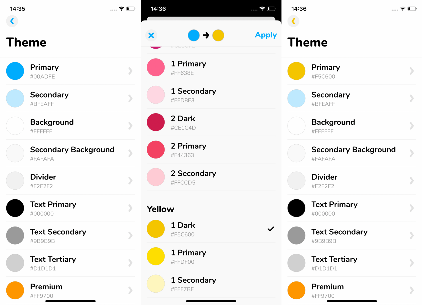
This shows the process of changing the primary color from blue to yellow in the theme, and the buttons that use primary color changes to yellow immediately. Why don’t we play and mix it more?
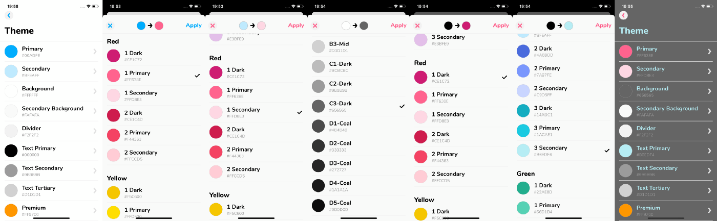
Changing primary, secondary, background, and textPrimary colors result with this grey backgrounded screen. We use these theme colors especially in the buttons, see how they changed:
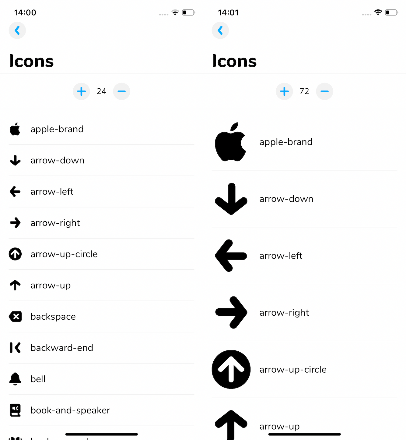
SVG Icons into Font! 👀
First, we created a separate repository for this purpose. We used fantasticon which is an icon font generation tool. It generates TTF, TypeScript, and JSON files. When we need new icons we add them to that repository. We run the command to convert SVG icons and then update our development repository with the new output files. Fantasticon’s documentation is so good, so I won’t go over it. I want to mention what we have gained after this conversion.
Earlier, we were putting icons as Image and it was making our application size larger. Styling was also taking the time.
Then, we came up with converting SVG Icons to the font. We can access them by using the Icon component.
✓ Takes less space on disk than png images. ✓ Fewer lines of code. ✓ Can be scalable to any size.
To see our icons list and how do they look according to the size, we created a page on our design system application.
Accessibility!
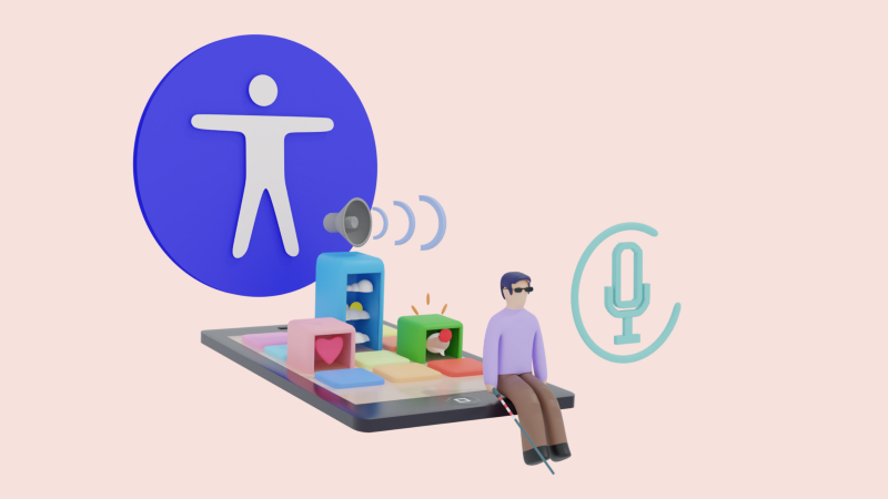
Accessibility is a part of our design system. During the building process of the design system, we also paid attention to how we can make our components and application accessible.
It is a long story so for further details, you can read an article about how to support accessibility in React Native from here. ⬅️
“With design system, we have minimized to use of time, maximized to speak same design language with design crew. Not just for that, but also design system has been an icebreaker to set up fast and healthy collaboration with the dev-team.” — Mehmet Çam, Head of Design at Otsimo
Hope you enjoyed this article!
If you’d like to see more articles, please subscribe to my newsletter 📨 Thank you for being here and for your support. 💙